One Room Challenge Spring 2018 – Week Two!

It’s already week two of the One Room Challenge! I don’t have much to show since sharing my dining room plans for Week One, but I am getting close to deciding on a wall colour for our dining room, the track lighting will be removed later this morning and the chandelier will be put up which means I’ll be able to start the daunting task of painting the ceiling. And coming to terms with the fact that it’ll probably need 3 coats of paint [like in our living room].

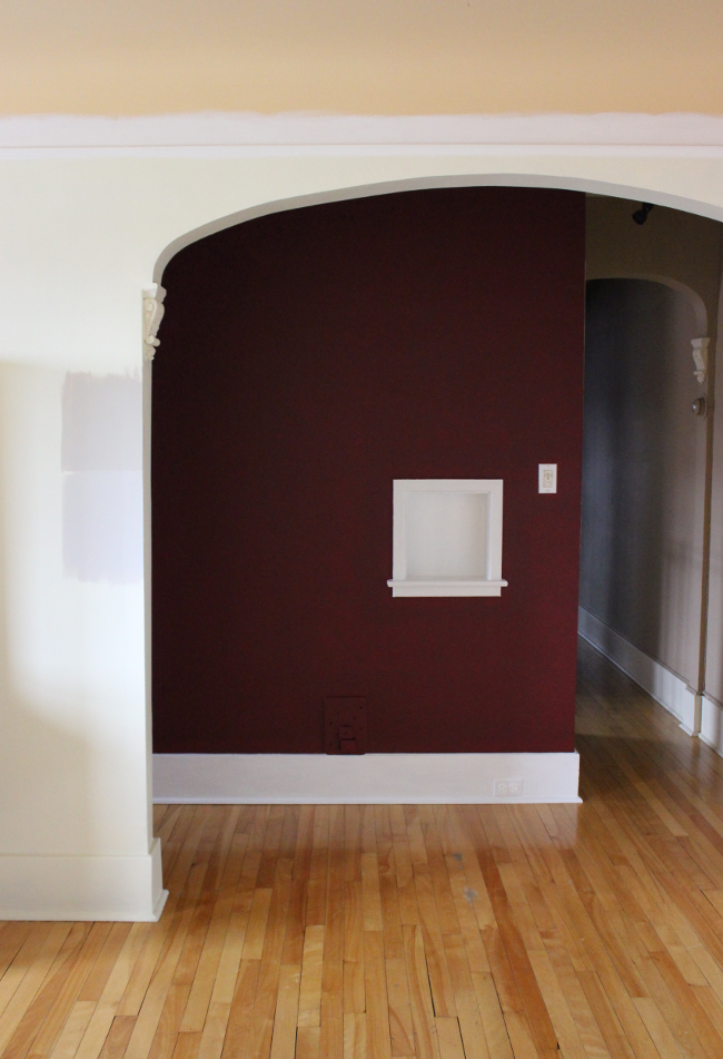
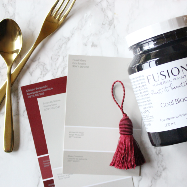
I painted the picture rail white ahead of repainting the ceiling and also painted the hall wall in my favourite Classic Burgundy on Sunday afternoon [it looks very dark here as it was a dull day]. Then on Tuesday evening I visited Home Depot to get paint samples for the main dining room colour. I looked at CIL‘s range of warm neutrals and picked up tester pots of Fossil Grey and Smooth Stone.

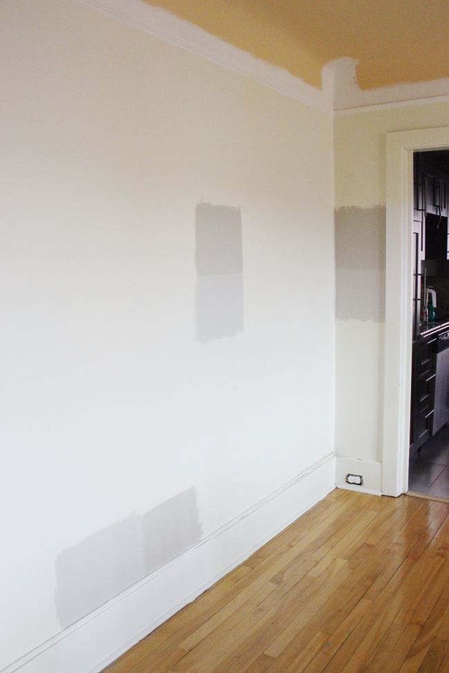
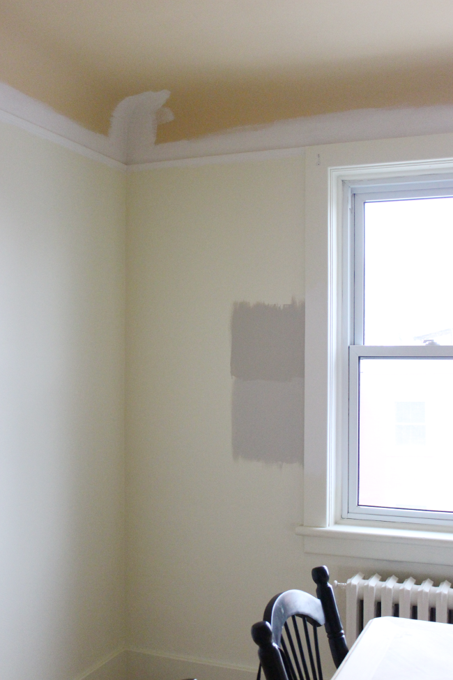
Both shades are warm shades of grey, but I’m not 100% on either of them. The darker greige, Fossil Grey, is more of the right colour I’m going for [vs. Smooth Stone which looks bluer], but I want to go for a much lighter version of it. That means more tester pots, but I’d rather that than buy 3.5L of the wrong colour. Which I very nearly did on Tuesday when I was looking at paint swatches [due to tiredness and an acute case of hangry].

Once the ceiling and the walls are painted I really can’t wait to try out my Coal Black pot of Fusion Mineral Paint on our dining hutch. I’m really looking forward to trying out distressing techniques on it and I might even paint a second piece in the same nearly-black shade.

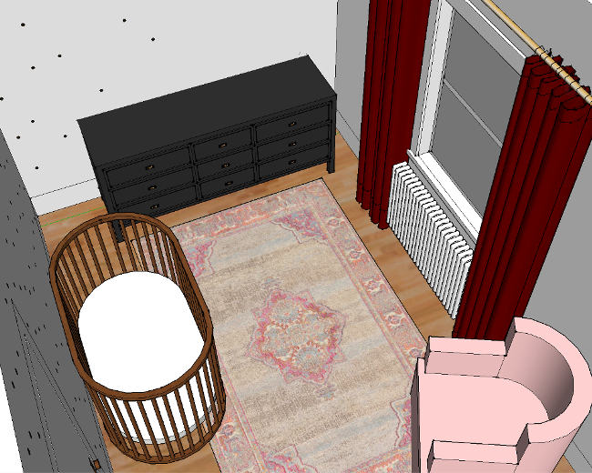
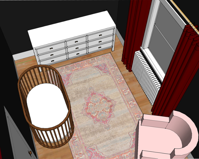
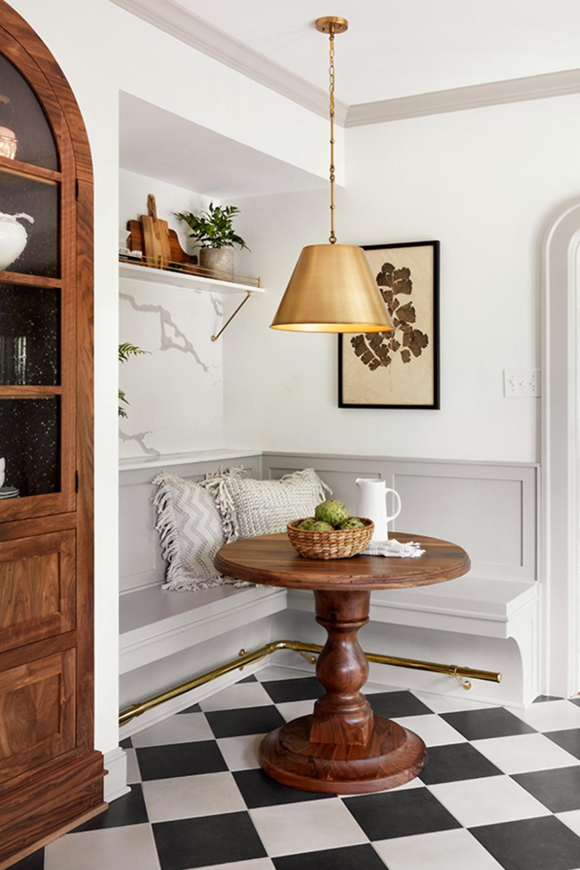
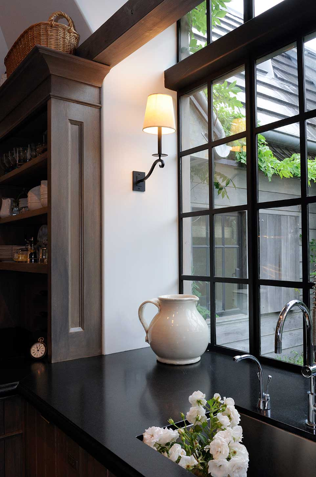
I didn’t think to share these last week, but below are a few images I’ve pinned over the past while that are the same vibe I’m hoping to create for our dining room; warm, inviting, relaxed and fancy. Meaning, I hope to god a few coats of classy paint are going to make up for the fact that I’ve been teaching our almost-18-month-old fart jokes instead of the alphabet.

I’m hoping to decide on a paint colour within the next week and at the very least have the ceiling painted before Week Three. If not, then I might start to panic as we’ll already be halfway through the ORC. No pressure. Just pick a colour.

If you’re curious, you can check out the full list of Guest Participants here! There’s a seriously good group of participants this spring.

Week OneWeek Two – Week Three – Week Four – Week Five – Week Six

Image credits – neutral nook and dark kitchen.

Two designs, one room. Which would you pick?

I’ve been taking my time thinking of a design for Cora’s bedroom. I measured her room soon after we moved in and since then I’ve made quite a few designs on Google SketchUp. Some good, some very bad. But only within the past few days have I managed to narrow down the design to two options; a dark design and a light design.

Keep in mind that these mock-ups are minus a lot of accessories and details that will be added to the room (like Cora’s faux taxidermy pig, her Katy Perry cross stitch, our Bill Murray print and some Christmas lights to name a few), so it looks very bare. The dark walls may seem a bit overwhelming, but they’ll be covered with fun pieces.

I got fancy and made Google SketchUp videos to show the different angles of each design. I went entirely dark with the dark room, but for the light room I added a kind of feature polka-dot wall. I didn’t want just one wall to have polka-dots, but I also didn’t want the entire room to be overwhelmed by them, so I kind of ombre-d the polka-dots onto each adjoining wall. Does that make sense? I’m using a lot of hand gestures as I’m explaining, but I realise you can’t see that. These videos will hopefully better explain what I mean …

I like the idea of a dark room for Cora as it might be a calm space for her (especially around nap time and bed time). I also like the idea of going with a less traditional colour palette for her / “a little girls room”. But at the same time, I want Cora’s room to be somewhere fun so I keep coming back to the light design with polka-dots. I am leaning towards one design in particular, but I’m curious to see if it’s the most popular choice.

So which design do you prefer? Are you more dark side than light side? Or does the idea of black walls in a little girls room make you think WHY WHY WHAT ARE YOU THINKING I’M CALLING CHILD SERVICES. I’m very curious to know, and even more curious if there are very strong opinions on either. I’m looking at you, dark side.


DIY Friday – paper storage bag for toys

Since immigrating to Canada, as you’d expect, we’re starting from the beginning with everything. Furniture, accessories and food [like, spices. You don’t realise how long it takes to build up your cupboard until you have absolutely nothing]. We’ve been here 2 months and while it’s going to take a lot longer to get everything we need, I am able to start thinking about small projects to work on. One of them was some kind of storage for Cora’s toys. 
I looked online for secondhand trunks and storage boxes but I didn’t fall in love with anything so I continued tossing Cora’s toys into the corner of her room. Then through an ad on Instagram, I was suggested a paper storage bag for toys. I thought it was cute, light and soft but at $30 [plus tax and shipping], I was unfortunately put off a bit [see first paragraph about how expensive the past few weeks have been].
A few weeks passed and on our way home one day we passed a driveway with paper yard waste bags from Canadian Tire waiting to be collected. I saw them and immediately thought, “How perfect would they be for storing Cora’s toys! If I painted one white, it could sit unassumingly in our living room and chaos would be restored to every aspect of our lives.” Perfect.

The next time I visited our local Canadian Tire I bought a pack of 5 bags for $2.69, headed home and began painting one white [which, by the way, was A LOT harder than I thought it would be]. That’s when I realised I was basically just making one of those paper storage bags I saw online a few weeks earlier. I was hesitant about sharing my project because it looks so simiar to the branded versions and I didn’t want it to seem like I’m copying them, but at the same time, I did think of the idea by myself too. After an overwhelming response to my Instagram stories poll and 100% of the vote going to “YES! BLOG IT!” [vs. “NO, YOU’RE A BAD PERSON”], I decided to blog it!
I’ll be honest in that it was pretty tricky at times trying to paint the bag [it continually collapsed while I was trying to paint the sides and I had the added bonus of teething toddler hanging out of me], so I wouldn’t blame you for wanting to buy one online and save yourself some hassle. BUT, if you’re like me, and like doing stuff yourself, my version cost me $0.53 for one bag [I used white paint I already had]. Not bad for something that Cora might literally tear through one day.