The importance of getting samples

One of the first things seared into our brains during our first year studying Interior Design was to always get samples. And boy am I glad I did this week. 

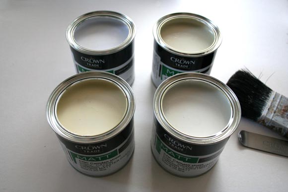
Rarely is anything as it seems. So when I was choosing a new potential color for my living room, I got a couple of samples of  Crown Paint shades. I really wanted to go for a dark strong grey, in my ideal home, but realistically, my living room is north-east facing and is basically a cave. 
I picked four of my favorite greyish {okay … off white} shades from the Crown website and did a patch test on my wall. And I was surprised. My preferred shade {Gallery White} turned out blueish, but that may be because two of my other samples turned out quite yellowy, which I didn’t expect. 
My main dilemma was the trim and skirting in my living room. It was originally a glossy white I presume, but with time it has aged and gone ever so slightly yellow {seen kinda on the left of the image below}. For this reason, my original want of grey paint was out of the question since it looked blue next to it / was making it seem even more yellow. So no more Gallery White. It was tough for me since I really wanted a strong grey, but we decided on Swans a’swimming, and I’m really glad we chose it. It still looks grey, and doesn’t make the skirting and trim look yellow. A warm grey for our cosy cave. 
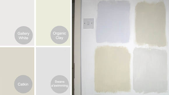
See the differences between what I chose online, and what they turned out in my apartment? The catkin is supposed to be more on the side of green, and I was expecting Swans a’swimming to be more blue than Gallery White. Always, always bring a sample into its destination environment before you decide on it. This goes for fabric, natural materials such as wood or marble, and paints. It saves you buying 2.5 litres of the wrong color. 

A little extra – dust covers

My little ‘deceptive dust covers‘ tutorial is today being featured on Design*Sponge and I am so very excited.  I had been in contact with Kate from Design* Sponge, who wanted to post more stylized interior images of my dust covers, and I was more than willing to take more pics. Here’s two more pictures of my dust covers, integrated amongst my other books. Plus a painting that I love that my dad did. Squeee.

After and before – Deceptive dust covers

This isn’t a new project to me. I first came up with this  deceptive dust cover idea close to seven years ago when I lived with my folks: I had a shelf in my bedroom holding everything I held dear. I am a neat freak and color coordination is paramount, so some of those things I held dear weren’t exactly, how do I say, appealing to my corneas. I created faux dust covers to cover up unsightly books and cd’s that I loved.
I’d like to say I don’t judge a book by its cover, but if it’s too bright for my living room I will hide it behind other books. Dark moody colors appeal to me more than bright ones – to each his own. So I sat down and over the past week I made covers for the books I enjoy too much and were making me feel guilty for stuffing them at the back of my bookcase – but no longer. Below I’ve written a little tutorial on how to make your own dust covers should you like to revamp any books of your own.

What you’ll need : enough heavy weighted craft paper {one up from construction paper} to cover your book{s}, ruler, scissors, pencil and eraser, thin gold pen, gold marker, and some form of adhesive – this is only used for adding another layer of paper to your cover – NOT to glue the dust cover to your book. We don’t want that. 

Step 1 : lay your book flat on the construction paper -completely flat- ensuring the spine is flat as well, otherwise you won’t get a truly accurate width of your book. Align with the bottom of the construction paper, this way you don’t have to cut out the entire shape of the book. Step 2 : on the construction paper, roughly mark the height of your book. Make sure to leave sufficient space on either side of the book to fold the side flaps (as seen in step 3). Step 3 : with a ruler, draw a lovely straight line for the top, and cut out. You will be left with a piece of paper the same height as your book, but wider on each side (above). 

Step 4 : fold the construction paper template around the book cover. What I do next is put pressure along the edges to make sure the folds are defined, as well as use my finger nail to define the edge of the spine. Take the cover off, and you end up with this. Step 5 : using a ruler and your gold marker, draw a design down the spine of your cover. Here’s where your creativity comes in. I took inspiration from some of my favorite old books, alternatively you can find images of old books. I also cut out a little label for added charm. Step 6 : with your pencil, lightly mark where you will place the text. Once you’re happy with it, go over with the thin gold pen. Affix any labels if you choose, et voila, you’re finished!
I’ve mingled these books in with my little existing collection. I have a lot of black bound books already, so I didn’t make any for this project. I’m also working on revamping my book shelves. It doesn’t sound exciting, but it is to me. I’m considering some interesting alternatives … Happy crafting! 🙂