
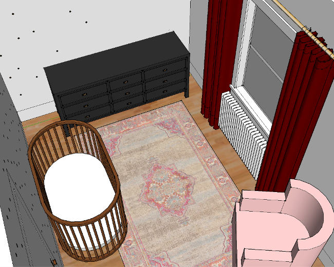
I’ve been taking my time thinking of a design for Cora’s bedroom. I measured her room soon after we moved in and since then I’ve made quite a few designs on Google SketchUp. Some good, some very bad. But only within the past few days have I managed to narrow down the design to two options; a dark design and a light design.
Keep in mind that these mock-ups are minus a lot of accessories and details that will be added to the room (like Cora’s faux taxidermy pig, her Katy Perry cross stitch, our Bill Murray print and some Christmas lights to name a few), so it looks very bare. The dark walls may seem a bit overwhelming, but they’ll be covered with fun pieces.
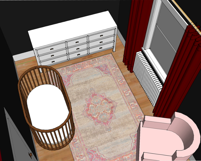
I got fancy and made Google SketchUp videos to show the different angles of each design. I went entirely dark with the dark room, but for the light room I added a kind of feature polka-dot wall. I didn’t want just one wall to have polka-dots, but I also didn’t want the entire room to be overwhelmed by them, so I kind of ombre-d the polka-dots onto each adjoining wall. Does that make sense? I’m using a lot of hand gestures as I’m explaining, but I realise you can’t see that. These videos will hopefully better explain what I mean …
I like the idea of a dark room for Cora as it might be a calm space for her (especially around nap time and bed time). I also like the idea of going with a less traditional colour palette for her / “a little girls room”. But at the same time, I want Cora’s room to be somewhere fun so I keep coming back to the light design with polka-dots. I am leaning towards one design in particular, but I’m curious to see if it’s the most popular choice.
So which design do you prefer? Are you more dark side than light side? Or does the idea of black walls in a little girls room make you think WHY WHY WHAT ARE YOU THINKING I’M CALLING CHILD SERVICES. I’m very curious to know, and even more curious if there are very strong opinions on either. I’m looking at you, dark side.
I think they both look stunning – and would look great with her special pieces around the room. It’s a tough one, but I think I’m leaning towards the lighter colour with the polka dots! The dots will give it a bit of fun, and I love the idea of them fading out across the room a bit – the ombre effect. That’s a really good idea! Full on dots all over the room would be too much; just the one wall would be too ‘feature wall-y’… but a few dots around the room will work perfectly! Also, I love how Cora’s cot looks against grey, another reason I’m leaning towards that idea. I think Bill Murray and the piggy will look really good with the grey and polka-dots too!
As for the black… you can do that elsewhere. Whereas I think the polka-dots is more suitable for Cora’s room than anywhere else probably.
But… whatever you choose, I’m sure I’ll love it! xx
Author
Haha, of course you like the dots version, Maria! 😜 I totally agree – I think I’m going to go dark in another room in our home, not Cora’s. Her room gets so much natural light that it just wouldn’t work going that dark. I went so dark in our living room because it gets almost no direct sunlight (well, we’ve not experienced a summer here yet so that might change), but it doesn’t make sense to go so dark in her room. I’m still not sure about what to do in her room. I’m incredibly indecisive! And it’s annoying but I’m just going to wait until I’m happy with a design before starting anything.
The black walls. All. Day. Long. Love it, so cosy.
Author
I know. I want black walls somewhere in our apartment but I’m thinking now because of how much light Cora’s room gets, I’m second guessing going black.