
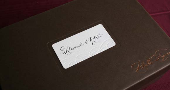
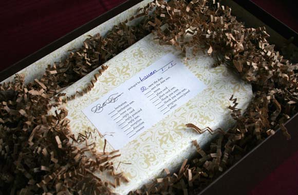
Slowly but surely I’m getting around to blogging our wedding details. I.e. our invitations. They’re little details like this that I adored pouring hours of thought into.
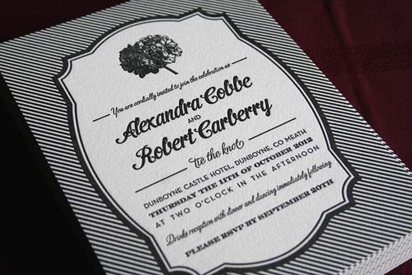
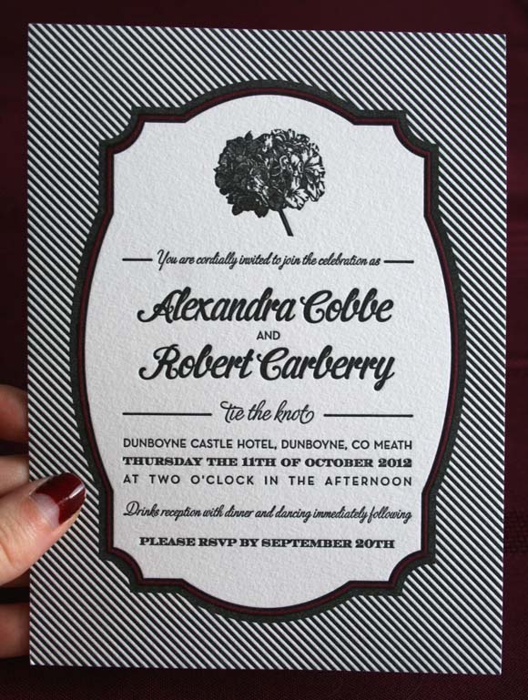
Back in May of this year hubby and I met with Pretty as a Picture to schmooze over their invitations. The moment we saw the Harbor Beach template by Bella Figura, we both immediately loved it {I was so worried we would have such different taste}. That strong and unique silhouette backed with those stripes was what won us over.
We customised our invitations my replacing the anchor with a hydrangea*, converting it to black & white {there were b&w stripe details in our wedding, such as the boutonnieres / buttonholes} customizing and justifying the text. I adored the look of mixed texts while keeping a strong justification, to almost counter-act the fanciness of the border going on around it.
Interestingly, I really liked the more masculine and stronger style text, while husband enjoyed the more detailed, italicized fonts. I was surprised at that one …

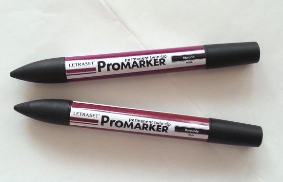
I made a further, cheeky customization to our invitations. We were on a tight budget, so we didn’t opt for a second colour on our invitations {black counts as one}. In stead, when we got our invites, I took it upon myself to add some colour. For the record, I would not suggest doing this unless you have a very steady hand and are confident / slightly mentally unbalanced and enjoy taking on extra and very stressful tasks. Using a combination of two of my old rendering markers from college, I coloured within the lines of the ornate border, and voila, our invitations have a hint of dark berry tones.
We opted for our guests to RSVP via text, which meant we got very speedy replies within a couple of days of each person receiving their invitation. We so modern and alternative.
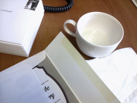
Lastly, a snap of my posting station. I made sure there would be no George-Costanza-fiance-licking-of-the-envelope incidents happening with me.
*you can read here all about how husband suggested we put a hydrangea on our invitations. Hand on heart, I didn’t make that decision. Seriously. Srsly.
again, adore, adore, adore. you and husband have such a good eye!! those strong graphics are amazing.
i also really like the added color, even if it was added stress! it really finishes it off. fab.
They look beautiful! And you did a great job colouring in the border — far steadier hand than I have.
Also, mad props for the matching berry moon manicure 🙂
It would seem my obsession with that colour is not so subtle after all 🙂 I adore it to the max. Om, nom.
Such a freaking SIMPLE way to add colour without the added expense.
Why didn't I think of that??? Brill.
Traditional Wedding Invitations
Thanks for your information, I also want to share something
Present quite a few personalized not to mention custom themed wedding invitations. Just about every individual develop are generally tailor made as small as the littlest characteristic, not to mention Wedding day Daily news Divas offers you an abundance as well as form, disposition not to mention expense plan.