
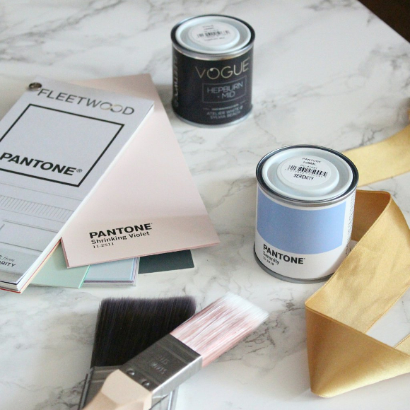
A few months ago the lovely people at Fleetwood Paints offered for me to try their new Vogue and Pantone ranges. They didn’t have to ask me twice! I unfortunately couldn’t decide on a paint for a long time thanks to suffering from a serious case of indecisiveness my entire pregnancy [hence things being so quiet around here too]. After much thought I decided grey would be the best hue for the nursery. Grey not only goes with every colour, but when it comes to us eventually moving out, grey is neutral so I won’t have to repaint the nursery. I headed to our local Fleetwood stockist, MRCB Paints on Thomas Street, and got started.
I took my time picking a grey. I have to say, the staff in MRCB were so helpful, especially re: my constant indecisiveness. It’s no wonder they won best Home and Design Shop for 2016! They deserve a patience award solely based on all my visits.
Our apartment is north-east facing so it gets very cold and unusual light throughout the day which I had a feeling wouldn’t make choosing a paint easy. I’d visit MRCB, pick a few tester paints, paint some patches throughout the nursery, let them dry, view the paint in the morning, afternoon, evening, good and bad weather and if I wasn’t 100%, I’d go back to MRCB, pick a few more testers and do it all over again. I think it took me 4 weeks to pick the right shade of grey, but I was fine with that as I didn’t want to rush into anything. Here’s one corner of samples to give you an idea of my thought process …
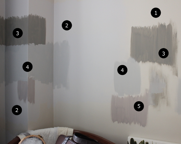
1. ORIGINAL WALL COLOUR – it doesn’t look half bad here, but the original wall colour was a weird washed out pink / brown / beige disaster. It complimented absolutely nothing about the room. So, no.
2. PANTONE ‘NIMBUS CLOUD’ – I was so excited to get started I nearly bought a 2.5L tin of this paint. Luckily I didn’t as Nimbus Cloud turned out to look quite cold and blue in the nursery due to the light the room gets. It’s hard to tell from this picture, but trust me. Paint doesn’t act normally in this room.
3. VOGUE ‘KENSINGTON DEEP’ – I wanted to see what a darker grey would look like, and for this room, a darker grey didn’t really work.
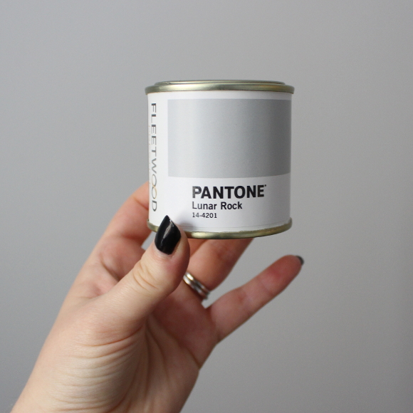
4. PANTONE ‘LUNAR ROCK’ – just one tone deeper than Nimbus Cloud, I was hoping this would be the right mix of warm and neutral grey. And luckily, it was perfect!
5. VOGUE ‘GOTHENBURG DEEP’ – we grabbed a tester of Gothenburg Deep along with Lunar Rock to see what a pinker hue would look like, but we both loved Lunar Rock once the final testers went up.
Throughout the room I had at least 3 more test patches in different grey hues, but I didn’t want to bombard you with very slight differing increments of grey. So I’m not going to. The important thing is that we got there in the end. Pantone’s Lunar Rock = perfect.
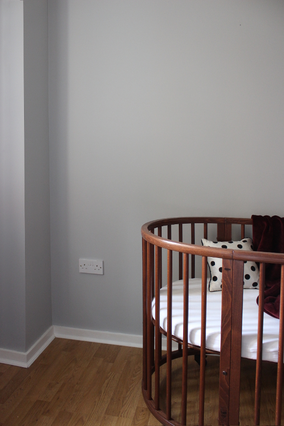
That weekend I put two coats of Lunar Rock on one wall in the nursery. As I was finishing, my parents called and offered to paint the rest of the room / save me and my hips [yay PGP :/], so thank you Mom and Dad DIYer for painting the rest of the room!
I’m beyond delighted with how Pantone’s Lunar Rock turned out. It’s such a warm hue without leaning too heavily towards a specific colour. It goes so well with our second hand walnut crib [more details on the rest of the room soon!], compliments the flooring and wooden wardrobes, and works beautifully alongside burgundy, pink, green – basically every other colour I’ve added to the room. A huge thank you again to Fleetwood for offering for me to try your new collection and to MRCB for all your help and copious patience.
Since painting the nursery last weekend things have been moving quickly and I’m so excited the more it comes together. After all, T minus 3 weeks until bebe arrives!
DISCLOSURE – while this blog post is not sponsored, I did receive this paint free of charge from Fleetwood via MRCB. I only work with brands and companies that I like and of course, think you will too. Thank you for supporting the companies that support The Interior DIYer.
Awesome. I tried to play the game, by picking my favorite. Turns out it is the same as yours! Lovely. Plays well against the rich wood of your ridiculously awesome crib.
I love your choice!! And I chose the same colour before looking at which was which in your picture 😀 It's a gorgeous grey! We have the same issue in our living room – northeast facing and weird light and the soft grey we have in there is just perfect, I'll probably never change it! Can't wait to see the rest of the room xxx
I love this grey!! It really is perfect – I also picked it as my favourite from the picture of testers. The walnut looks amazing next to it too – I am so excited to see what else you've done!! (About time too – little babs is nearly here!!!) 😛 xx
Yaaaay! Number 4 FTW! 😛 xx
Oh my – that cot is FABULOUS and the grey is fantastic too! Good luck for these last few days before baby arrives and of course good luck for when baby HAS arrived! The first 6 weeks are both crazy and fabulous – it is both difficult and incredible for every new mum so don't be hard on yourself. Can't wait to hear your news when the time is right. Best wishes!
Thank you so much Holly. And I'm so expecting and going to embrace the craziness as well as I can 🙂 It's nothing we've ever experienced before so we're fully expecting a giant learning curve, in the best way. We just both can't wait for our little bundle to arrive now! I'm currently 4 days overdue … Come on, baby.
And our cot – I've been meaning to write a post about it! It's so amazing and I'm so glad I scored it secondhand (because there's no way in hell we'd be able to afford it brand new).