Design goals – Peruke & Periwig

This weekend one of my besties introduced me to Peruke & Periwig for brunch. And oh man, it is the ultimate. Not just the decor, but the food and literal flaming cocktails are to die for. I had the French toast with a Walking Dead cocktail. A great way to start a Sunday if you ask me. 

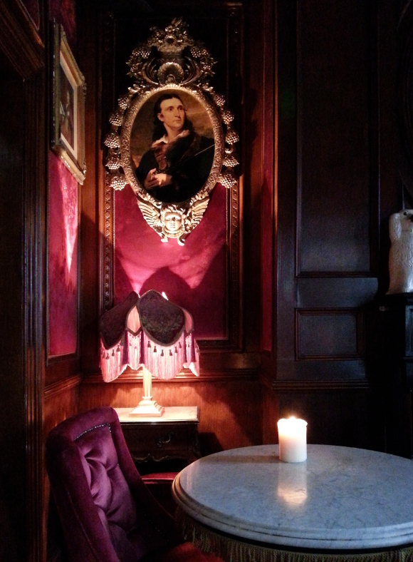
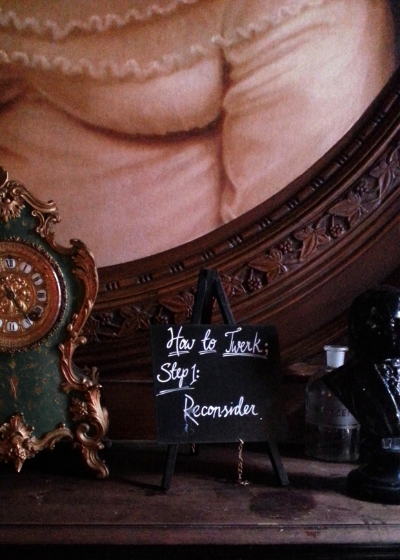
The ground floor is what I would imagine the Hog’s Head in Hogsmeade to be like in real life. Then upstairs. Oh, upstairs. It is my dream home. Velvet on anything that sits still, including the walls. Ornate picture frames, cloches, busts, tassels and more tassels. And dark. Soooo dark. I touched everything.

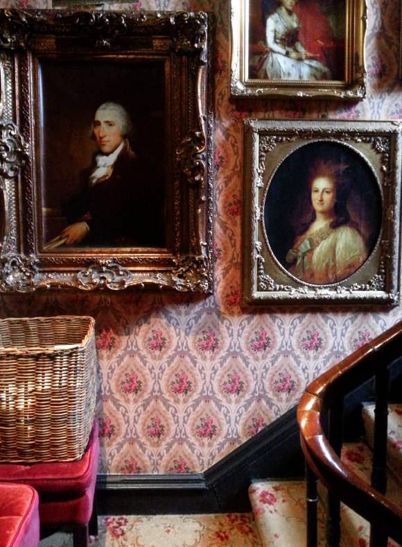
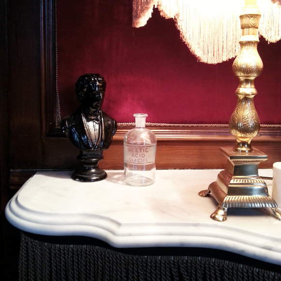
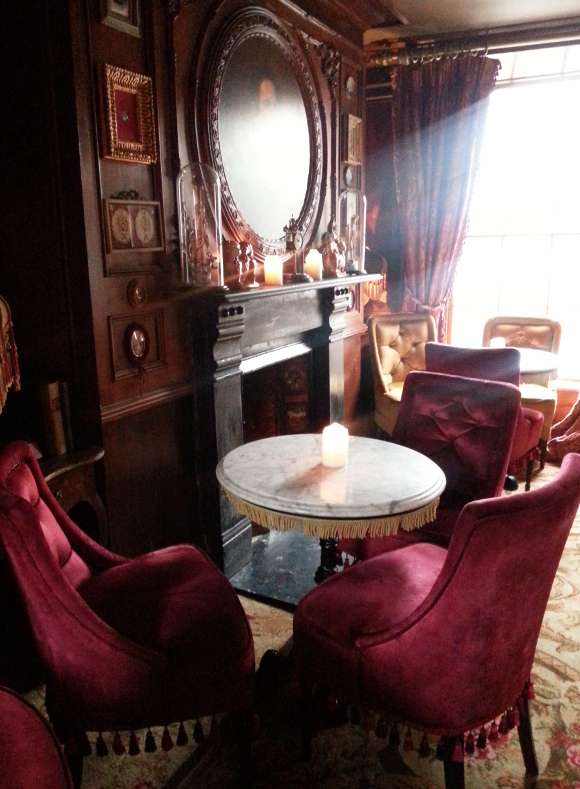
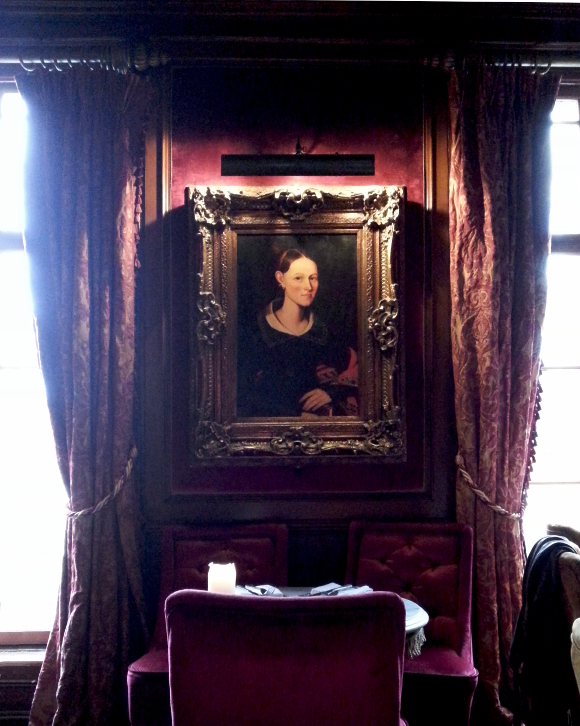
Serious design goals. My crappy phone pictures don’t do it nearly enough justice. I can totally envisage our [eventual grown up] house looking like this, juxtaposed with minimal chaise lounges and the likes. The atmosphere was pretty incredible. 
As soon as I walked in, I knew I wanted to celebrate my impending 30th birthday here, starting with a killer brunch at Peruke & Periwig, surrounded with velvet.  
If you are ever in Dublin, you must go to there if you can. A perfect escape from a rainy afternoon. It is yes. 

Working on my shelfie

I recently vented about wanting to paint over our burgundy feature wall. I love burgundy, but for some reason it was really getting to me. I was being driven insane [I know, total #FirstWorldProblem]. It was, dare I say, too much burgundy?

But in reality, the last thing I want to do was to paint over it. Even though feature walls are a bit of a faux pas these days [I’m not one to stick to trends], I still love ours. I sat down and stared at it; trying to figure out what irked me so much about it. Then I realised there was simply too much – a burgundy wall, burgundy books, red books, purple books and burgundy accents all over the shelves [which you can see a bit here]. It was too much of the same colour in such a small space. So I gave our wall one last chance before getting my paintbrush out. On Monday evening I took everything burgundy off our shelves and went strictly black and white with little pink and viridian highlights …

While I was de-burgundying, I tried to take a fresh look at our shelves. It’s tough though when you’ve been staring at the same shelves for 5 years [and can’t do much because they’re your landlords], so I tried mixing up the monotony of the layout by removing a couple of shelves to fit in larger pieces [cloche and desk lamp]. I wish I did this years ago …

I of course had to reintroduce the kitty nook back into the shelves as part of making the layout simpler and sassier. It was quite sad when I got rid of the kitty nook by putting books on that little shelf; Juniper would walk up to it and stare at it longingly. To say she was excited when it returned is an absolute understatement. She clambers onto the chair and up into her cosy nook once again.

I’m hoping you’ll also pay special attention to my obvious pairing of the pillow with the spine of Abigail Ahern’s Decorating with Style book under our Robert’s radio. Marvel at my sublime coordination skills and including a new colour in our home! I’m breaking out. Aren’t you impressed? Next I’ll be trying socks with sandals.

I’m not sold on the layout of the right shelving unit yet [as seen in the second picture]. I need to put a bit more effort into that one, but as for the left unit, I am completely game. The burgundy wall no longer fights with what’s on the shelves. The pink and minuscule amounts of viridian compliment it nicely.

You’re safe for now, burgundy wall. I’m glad we’re on speaking terms again. 

Life imitating catalogue

Over the weekend I was fussing over our bar cart; rearranging stuff, adding new tumbler glasses and finally getting around to re-syncing our clock. And then I had a teeny, tiny, mini ‘aha’ moment. 

In the winter of 2010 I brought home the current Marks & Spencers Home catalogue at the time, solely for its cover. It gave me heart-eye emojis, inspired a lot of what I did to our apartment afterwards and pretty much summed up everything I was digging at the time [I even blogged about it]. All those dark moody hues mixed with pops of bold pink and turquoise viridian really got me right in the feels. That catologue has been on display in our apartment since the moment I got it. For anyone who’s crept my blog for the past 5 years, you will have seen it from time to time. It wasn’t however until this weekend while I was dusting off said catalogue that I realised our couch is a little bit nailing it … 

Overcrowded with pillows, velvet and throws in lots of yummy dark colours and not forgetting the burgundy wall in the background [but let’s quickly forget my landlords hot mess of a leather couch]. I find it funny and kind of weird when things come around like that. Hardly blog worthy I know, but it was a funny realisation for me at the time. I’ve adored these colours for so long that this has only cemented how I feel about them.
It took me 5 years, but at least I took the scenic route.