Bathroom skirting board update

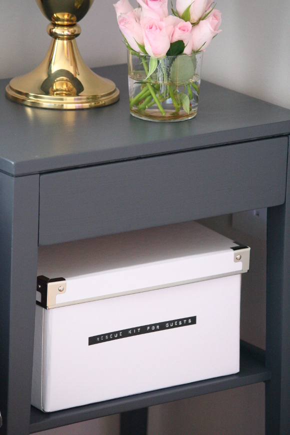
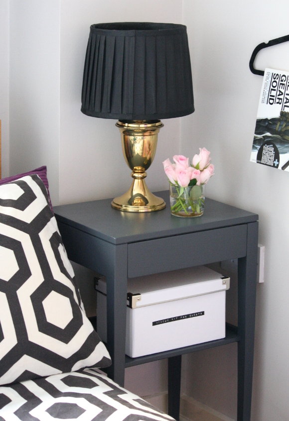
Sometimes it takes me a long time to pluck up enough courage to ask a question. Last April [ahem, April 2013], our landlord visited our apartment as he hadn’t seen it since he moved out 8 years ago. He was very happy with how we were keeping it, but had mentioned some areas of the apartment had aged and talked about getting someone in to repaint the discoloured skirting boards. And then a year and a half happened. 

I FINALLY emailed our landlord last week proposing I paint the skirting boards [after all, I don’t want strangers in our apartment + I do find painting relaxing]. He had no problem whatsoever and even went as far as to say if there was anything else I thought needed updating, he would cover the cost. !!!!!!! Trust me when I say I screamed a little at my desk. More on that another time! 
Apologies in advance. My camera has been acting up, so I had to take most of these photos on my phone. 

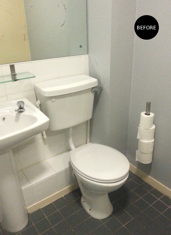
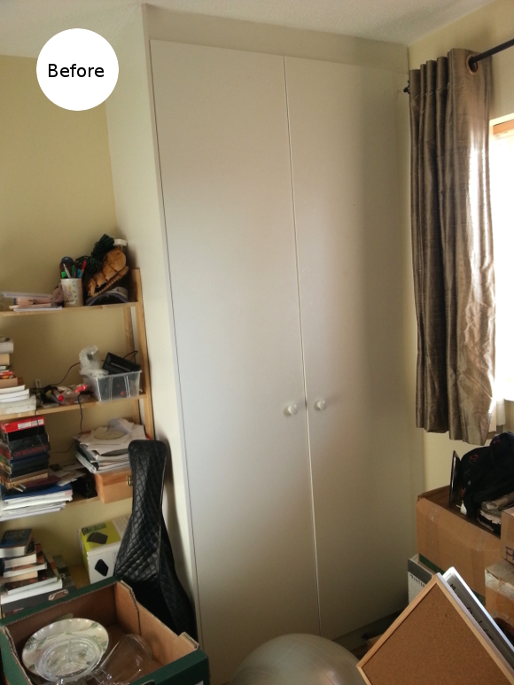
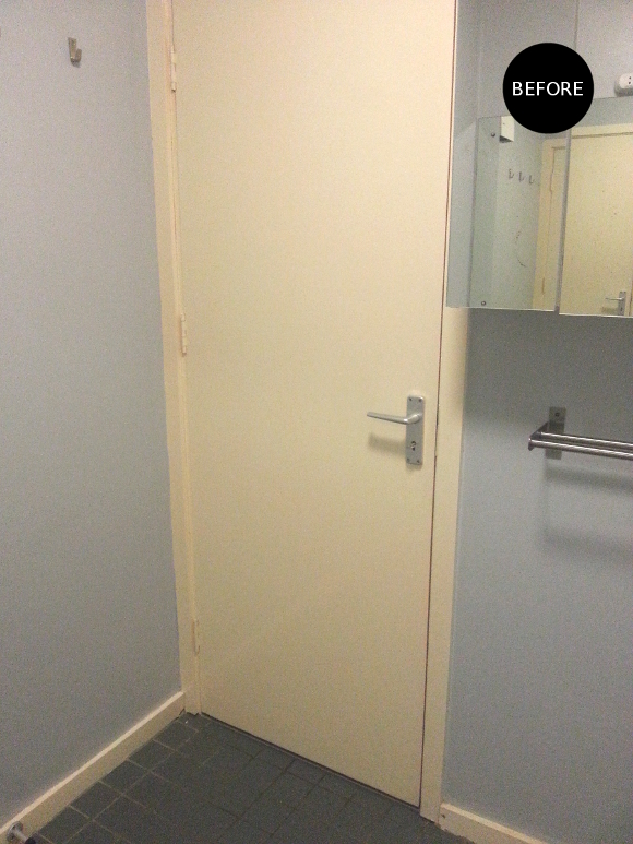
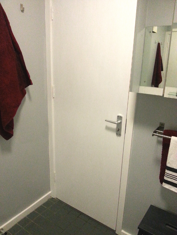
The skirting boards and doors throughout our apartment were, I’m assuming, originally painted white. But aged quite terribly and were so ugly and yellow that my eyes were in a constant state of almost bleeding. The discolouring of the paint is most noticeable in our bathroom. Unfortunately, the colour of the skirting boards and the door made not only the grey walls look blue, but the grey floor tiles too. It was EMBARRASSING. Whenever we had guests over I had to emotionally detach myself from the situation whenever they used our toilet. As far as I was concerned, they were going in there and closing their eyes, right?

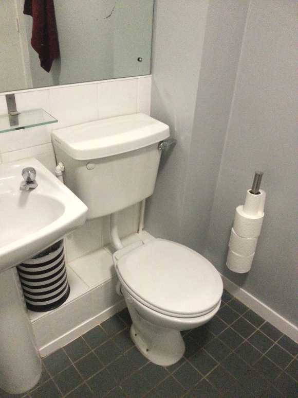
After I got the go-ahead from our landlord last week, I hurried to B&Q and bought a 2.5L tub of Dulux Stay White Satinwood and got painting. As advised by the paint expert in B&Q, I first cleaned the existing discoloured paint with turpentine on a rag, sanded the paint [as the original paint had a high gloss finish], wiped any dust off and started painting. 

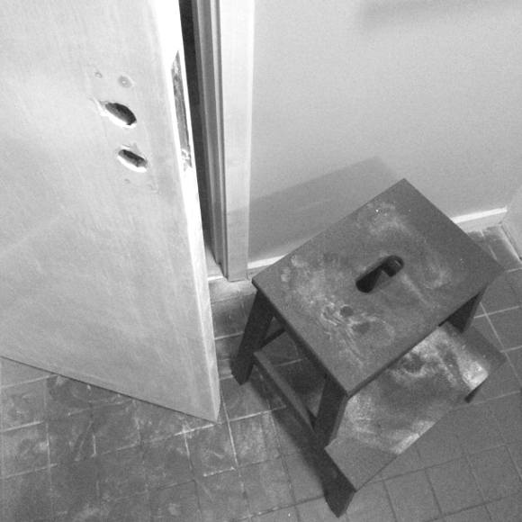
Since I’ll be updating all the skirting boards and doors slowly, one room at a time, I wanted to do a legit job. I removed all the door hardware, cleaned it and added them back after the paint had dried. Above was my panic moment when I thought oh dear lord, what have I gotten myself into? 

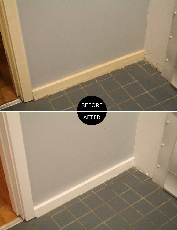
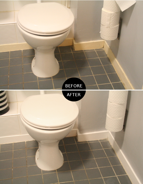
Okay, I might be going a bit over the top with the before and after pictures, but I’m so pleased with how much better our bathroom looks now that it less resembles an abandoned veterinary clinic. I promise I won’t be inundating my blog with before and after pictures of every room once it’s repainted. Our bathroom was by far the most obviously-discoloured. 

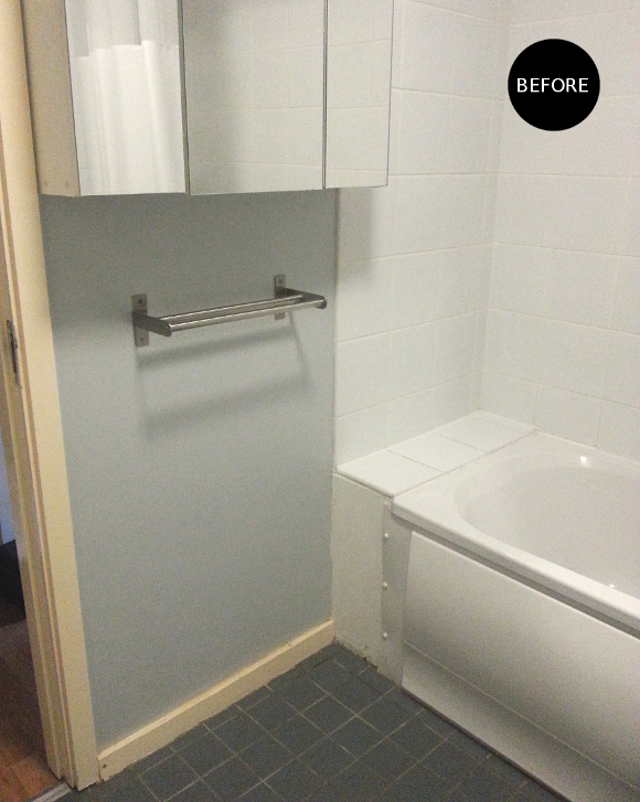
There are two aspects of our bathroom that need further updating – 

THE MAIN MIRROR – [as seen above the toilet. It spans almost the width of the room] it’s really worn and just way too much mirror. Nobody needs to see that much of themselves. 
THE FLOOR GROUTING – I don’t think the previous tenants cleaned the floor. Ever. So unfortunately the grout in the bathroom as well as the kitchen is really discoloured. At least now that I’ve repainted the skirting boards and door it’s a bit less obvious, but I still want to see if I can dye the grout a darker colour. I’ve tried lightening / lemon-vinegaring / bleaching the grout, and nothing. Chemical warfare is my only option.
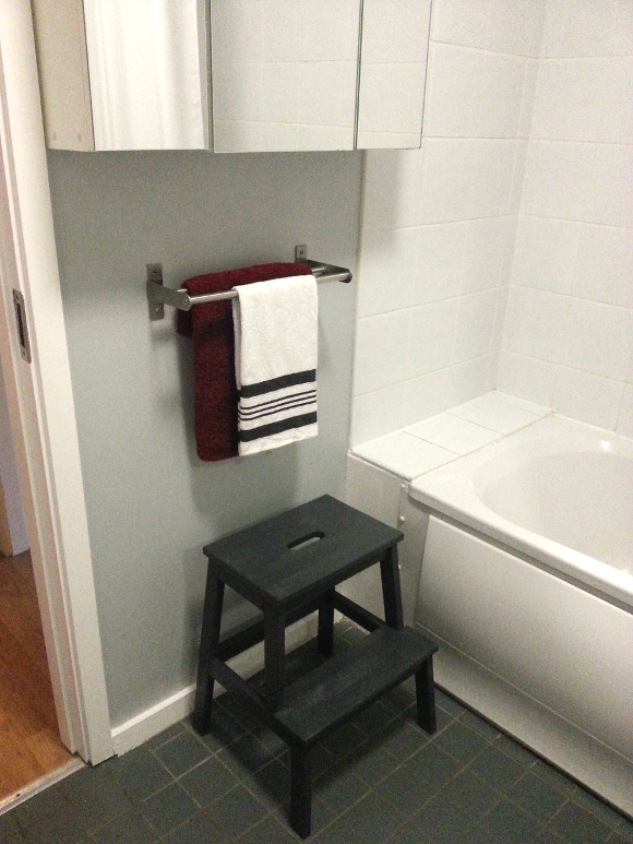
But for now, I’m very happy with our clean, white bathroom. xx A

Guest bedroom bedside table – updates

Have you ever decorated part of your home and once it was finished, it didn’t exactly look better? Yeah, that happens around here more often than I’d like to admit. 
Case in point, our spare bedroom earlier this year [below]. I painted our bedside table black and accessorized it with pieces I wasn’t particularly fond of and it was all just BLEUH. Everything needed a bit of an upgrade, so on Monday night I repainted the bedside table with leftover Dulux Exterior SatinWood ‘iron clad’ paint that I used on our living room stools. This paint is meant for front doors, but it works like an absolute dream on furniture. 

Upgrade step 1: complete! Now onto step 2: in keeping with my current a bit less IKEA phase [ie – our new old desk], the next step was to find a replacement lamp for the IKEA lamp we had. Yesterday I took to my well-worn Dublin charity shop route and I spotted this absolutely lush gold lamp in Second Abbey …

Phwoar. Isn’t it well lush? I headed to Dunnes Stores and picked up a small black pleated lamp shade to bring it out of the early 90’s, and I’ve got to say, I’m ridiculously pleased with how it turned out. Just LOOK at it …

All shiny and gold and pretty. I next upgraded our rescue kit for unexpected guests box [psst – you can also see what the bedside table originally looked like in that post]. I had a spare white KASSET box from my DIY holiday memory boxes, so I added the contents of the rescue kit to the slightly fancier box and added an old school Dymo Omega label to balance out all the fancy. And damn straight, I am mixing gold and silver. 
And last but not least, I decided to jazz up the bedside table by doing something I almost never do – I bought flowers. I love flowers in our home so I don’t really know why I’m always hesitant to buy them. I will admit part of me thinks it’s a bit of a waste of money. I know that sounds harsh. I tried to curb my opinion by buying these pretty pink roses which were reduced yet absolutely perfect [WINNING]. I trimmed them into one of our gold tumblers, et voila. 

When I showed husband the new getup in the spare bedroom, the first thing he said was “are you sure you want to keep that lamp there? It’s really nice and we’ll never see it in the spare bedroom … “. He makes a good point. Yes, he may be critiquing my styling placement, but I’ll focus more so on the fact that he thinks I made a kick-ass Frankenstein lamp 🙂 xx A

New project – Canadian man cave, office edition

I’m really excited today to share my latest project as it’s very close to home; I’ll be lending some of my design expertise to my broseph to help szhuzh-up a gentleman’s Canadian man cave makeover to his new office! And I’m getting all sorts of emo all up in here looking at Canadian mood boards. 
My broseph is currently in college so the budget is pretty tight. I’ll be working on recycling and upgrading the pieces of furniture and accessories my brother already has and reincorporating them in a new way. I like a good budget challenge! 
To give you an idea of the room, below are a couple of pictures showing what my brother’s office looks like at the moment [keep in mind he just moved in, so there are a variety of items / boxes in here at the moment] … 
First up – we’re going to kill that magnolia with fire. We’ll be changing the layout of the room and since we’re a little strapped for space, we’ll be making the most of the walls. I’ll also be adding lots of tiny and budget-friendly changes such as updating and coordinating the handles on the closet with the soon-to-be revamped drawers [as seen in the corner of the second ‘before’ picture]. 
To give you some visuals and a better feel of the mood I wanted to create for this room, below you’ll find the inspiration from Pat that started it all … 
When I first saw Pat’s Canadian cabin nursery design, I knew something along these lines would be perfect for my brother. He is after all, the only legit Canadian in our family. I loved how Pat’s nursery wasn’t over the top cheesy-patriotic, but it so perfectly incorporated a Canadian slant into the design.
And some clean, gentlemanly office inspiration that I stumbled upon on Pinterest. So far, here are just some of the ideas I’ve magicked up with my brain machine … 

1. I was thinking a subtle way of adding some personality to the office without going too OTT with colour is to add some colour to the curtain rod. This can easily be done with spray paint, doesn’t cost a lot, and can also be repainted at a later date [side note: there won’t be black curtains].

2. The cardboard stag’s head I bought in Marks & Spencers last year has been gathering dust in our apartment, but it will look perfect in my broseph’s new office. Ca-ching. 
3. I don’t know how possible this will be, but I’d like to include either a birch branch or birch bark into the design. Now, all I have to do is find some birch available in Ireland … 
4. Clipboard wall! One idea I had as a functioning focal point was to have a clipboard wall above his desk, as an alternative to a bulletin board or chalkboard wall. A chalkboard wall would be too dark and overwhelming in such a small room. Whereas a row or two of clipboards would be able to hold not only assignments, but tickets for events, reminders, and similar to what’s in our kitchen, I could paint one of the clipboards with chalk paint so it can be taken off the wall and written on. 
5. I’m going to try my hand at DIYing some pillow case covers by upcycling some old plaid shirts [see below inspiration on this idea from Pat].  
6. I couldn’t resist including the man blanket I crochet for my brother a couple of years ago. It and other textiles will add another level of comfort to the room for snuggling up on crappy rainy days and watching movies.
7. I’m still on the bench when it comes to wall colour. I’d like to with a warm shade of grey that’s barely there grey. Really close to white, but enough grey that broseph’s white desk will stand out. I think grey, when used in the right conditions, can make everything else POP in a room and add warmth. That is, with the right shade. We’ll see how the paint tests go. 
I’m excited to get started and help my little [yet an entire foot taller] broseph with the gentleman’s office he deserves. I’ll be sharing updates on the room as it develops so stay tuned! 

xx A

p.s. “Office edition?” I hear you say. Yes, office edition, meaning there’s gonna be MOAR ROOMS! I’ll be updating broseph’s bedroom too after his office is sorted.